Agency
Bernstein GmbH
Year
2018
Roles
Information Architecture
Wireframing
UI Design
Visual Design
Context
Made with LUVE is the brand of a startup seeking to come up with vegan drinks, desserts, yoghurts, and ice cream that taste just like if they were milk-based.
They came up with a way of extracting proteins of sweet lupins which are free of lactose and gluten by nature.
Challenges
Since we had done previous work for the company – their social media presence – we already knew about the pain points their targeted customers faced.
- “What are lupins?”
- “Your products must be so artificial”
- “Where can I buy your products?”
- “Can I substitute your drink for milk?”
Information Architecture
Since we didn’t create the then-current website, I won’t show it here. But let’s just say that we saw room for improvement in a few areas. We wanted to make sure users would find the information they were seeking easily. That meant looking at the pain points (listed above), re-structuring available content, finding missing topics, etc.
The previous primary navigation was quite deep and we wanted to change that. As an example: We placed “Lupins” in the main menu, because we knew a lot of people had no idea what those are.
Main Navigation
- Home
- About Us
- Lupin
- Products
- Recipes
- Shop
Besides the simplified global navigation, the website features associative, contextual navigation connecting most of the pages (and subpages) with each other.
Wireframes
We iterated on many different versions of the website and its pages, shuffled the content around, always trying to empathize with our target audience.
Eventually, we presented the wireframes by hanging them on the wall and going through each page, module by module.
It’s oftentimes hard for clients to work with wireframes, because it’s just not something they do everyday (if at all), but I feel this step is always an important one. I feel that once you show actual visual design, the discussion revolves around aesthetics, and not about structure and function. And as we all know, form follows function. Also, once you explain the basics to the client, they get it and work it quite well.
Design System
The design of the website is a constant battle between being unique / on-brand / organic and being usable / yummy / geometric.
Colors
#63277F
Primary
#DFD3E5
Secondary
#E6E6E6
Tertiary
Typography
Headline
Paragraph
UI Elements
Button
Input
Scrollbar
Outcomes
Challenge 1
“What are lupins?”
The patented extraction of the lupin protein is a complicated process, but visualising it in a simplified way helps to explain its naturalness.
Compared to the common soy drinks, a milk alternative based on lupins has quite a few advantages.


Challenge 2
“Your products must be so artificial”
Besides explaining what lupins are and how they are processed, we wanted to show what’s in them very clearly.
We also didn’t want the website to feel like a typical shop, so we didn’t go for the regular grid view and instead came up with a unique navigation which includes the products’ colors.
We prototyped the interaction thoroughly because we really didn’t know if users would understand it – but found out that in fact they did.


Challenge 3
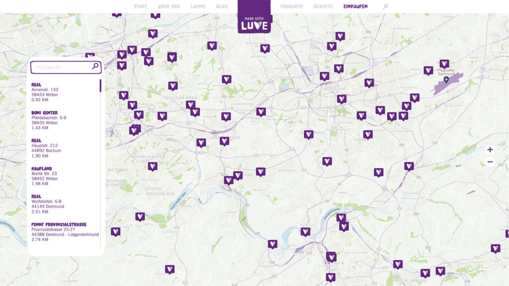
“Where can I buy your products?”
For a startup, availability in stores isn’t given all the time. But we wanted to make it easy for possibly buyers to find out where products would be available to buy.
Sounds easy, but collecting all this information was a tough job. It took quite a while to find out all the information like the address, coordinates etc. We even collected which product lines would be available at the store, to show that as icons in the product finder – unfortunately, this feature was later dropped.

Challenge 4
“Can I substitute your drink for milk?”
Yes, you can. The client created a lot of recipes which you would commonly create with a milk product, as well as other vegan recipes.
We wanted to make it easy for the users to find fitting recipes, as well as connect the recipes with specific products.

Conclusions
There was some drama in the choice of development, which made the project take longer than it should have. But the website paved the way for the brand going forward and has been used as the basis for the brand and the design.
Overall, this website was and still is a good balance between learned interaction and uniqueness.
